
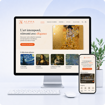

E-commerce photography and conversion
Good images don't just show a product. They answer the questions that prevent you from buying it.
An effective e-commerce image must attract, inform, reassure and help project oneself. The right choice depends on the page, the product, the target and the stage of the journey - not just the beauty of the visual.
A beautiful photo can be a bad product photo
If it hides shape, changes color, doesn't show scale, or distracts attention, it creates uncertainty. The visual must first serve the decision.
The right question to ask
For each image, ask: what information does it provide that others do not? A useful gallery combines several complementary roles.
The 8 types of images to plan for
Main view
Entire product, readable framing, controlled background and faithful color. It must remain understandable in a small vignette.
Complementary angles
Face, back, side, interior or underside depending on the customer's natural questions.
Details and materials
Zoom in on texture, stitching, finishing, mechanism or component to demonstrate quality.
Actual scale
Product worn, held in the hand or placed near a familiar object to avoid size errors.
Scenario
Show the product in its actual use so that the visitor projects himself into the expected result.
Variants
Photograph each color or finish with identical conditions and link it to the correct Shopify variation.
Operation
A sequence, a light infographic, or a short video explains a mechanism better than a long paragraph.
Packaging and content
Show what's delivered, accessories included, and presentation if the receiving experience matters.
Concrete example: three images, three different roles
These three visuals show the same type of product, but each answers a separate question from the customer. It is this complementarity that makes a gallery truly useful.

1. Main view
The entire product is immediately identifiable. Discreet background, stable framing and margins make comparison in a collection easier.

2. Material detail
The close-up proves the texture, regularity of the seams and the finish of the clasp. It supports perceived quality and price.

3. Scenario
The worn product reveals its actual size, fit and style. The visitor can project himself into daily use.
Why all three are necessary
The main view helps to recognize, the detail helps to believe, the scenario helps to project oneself. Repeating three similar photos provides less value than this combination.
Which images to use depending on the page?
| Location | Objective | Recommended image |
|---|---|---|
| Host Hero | Expressing the universe and promise | Strong scene, identifiable offer and quiet area for text |
| Collector's card | Have a category recognized | Simple composition, consistent framing between all the cards |
| Product sticker | Compare quickly | Homogeneous front view, constant background and well-sized product |
| Product sheet | Inform and reassure | Complete gallery: main view, angles, details, scale and usage |
| About | Humanize and prove | Portraits, workshop, team, gestures or real environment |
| Blog article | Explain | Directly useful captures, examples, diagrams and illustrations |
Build a coherent visual direction
Define an intention
Choose three brand adjectives - for example natural, precise, warm - then check that each image translates them.
Set the rules of light and color
Decide on contrast, temperature, shadows and touch-up level. Product colors must remain true.
Standardize framing and ratios
A homogeneous grid seems more professional and avoids layout jumps. Plan the formats before the session.
Create a list of shots
For each product, list the mandatory angles, details, variations and usage situations.
Control the whole thing, not each photo in isolation
View images side by side as they will appear on the site to quickly spot inconsistencies.
Images from photographer, supplier, stock image or AI?
Original photographs
The best choice to differentiate the brand, faithfully show the product and create a consistent library.
Supplier images
Quick to use, but often identical among competitors. Check rights, quality and accuracy.
Image banks
Useful for certain editorial content, rarely ideal for representing a real product or team.
AI-generated images
Interesting for an atmosphere or a concept, but to be strictly controlled. Do not create a misleading representation of the product.
Technical quality without slowing down the store
Adapted dimensions
Import enough size for zoom, without unnecessarily sending a gigantic image. Shopify then generates several variations.
Modern formats
Choose JPEG or WebP for photos, PNG for transparency and SVG for simple vector illustrations.
Controlled compression
Reduce weight while checking details, gradients and any text embedded.
Constant ratio
The same ratio on products avoids irregular maps. Choose square, portrait or landscape according to the catalog.
Alternative text
Briefly describe the product and what is visible. Avoid keyword stuffing and incomprehensible file names.
Mobile testing
Control cropping, readability, zoom gesture and speed on a real phone.
Mistakes that make you lose confidence
Inconsistencies
- Different backgrounds and lighting
- Larger product on some variants
- Non-faithful color alterations
- Mixed ratios in grids
Missing information
- No view from the back or inside
- No scale reference
- Important details not photographed
- Accessories included not specified
Misleading images
- Decor suggesting an accessory is included
- AI modifying the shape of the product
- Filter altering the actual shade
- Generic photo without exact report
Usage issues
- Files too heavy
- Essential text embedded in the image
- Hero impossible to crop on mobile
- Insufficient contrast behind the buttons
Checklist before publication
Frequently asked questions
How many images should you put on a product sheet?
There is no universal number. Use the number needed to answer questions without repetition: often five to eight visuals for a product that deserves multiple angles and details.
Should you always use a white background?
No. The white background facilitates comparison, but scenarios reinforce projection. A gallery can combine the two.
Can we use images found on Google?
No, unless explicitly authorized or licensed. Always check usage rights and keep proof of license.
Are images with text recommended?
Use them in moderation. Text may become unreadable on mobile, is not always accessible and complicates translations.
How to choose the main image?
Choose the one that immediately identifies the product, remains readable in small format and visually aligns with other thumbnails.
Your images should inform as much as they appeal
Build a store that is more consistent, more credible and easier to buy
Improve your product sheets, your collections and the overall presentation of your catalog.
