
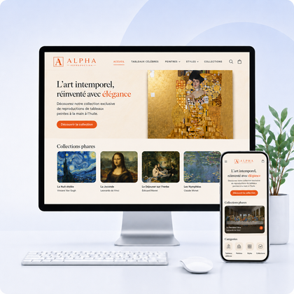

Brand identity and experience
Your homepage should get your brand recognized before the visitor even reads everything.
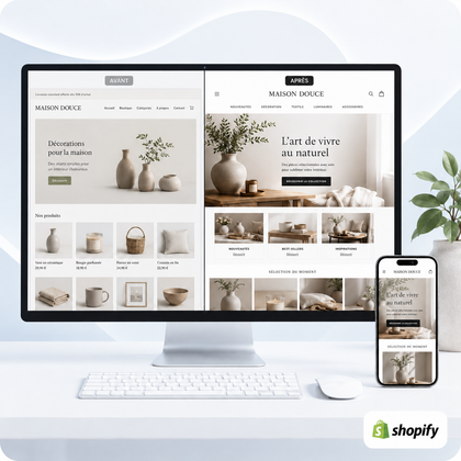
A good homepage doesn't juxtapose a logo, colors and products. It translates a promise into experience: what you sell, for whom, why your approach is different and what action to take next.
Branding isn't just visual
It brings together your positioning, your personality, your price level, your tone, your evidence and the quality of your service. The home page should make this set immediately noticeable.
The five-second test
A new visitor should be able to say what you propose, who it is for and why it should continue. If only the mood is understood, the message must be reinforced.
Before designing the page: define the brand base
Your priority target
Describe their needs, their level of knowledge, their objections and the criteria that guide their decision.
Your promise
Formulate the main result that the client can expect, with simple and specific words.
Your difference
Identify what is truly distinct: selection, method, manufacturing, expertise, speed, service or customization.
Your personality
Choose three guiding adjectives, for example warm, precise and modern. They will guide texts and visuals.
Your level of range
The pace, images, information density and evidence must support the price and associated expectations.
Your priority action
Discover a collection, reserve, request a quote or buy: the page must lead to a main objective.
A homepage structure in 8 sections
Hero: the main promise
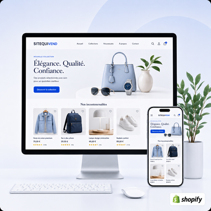
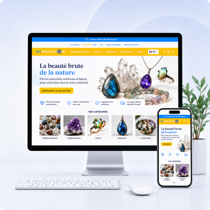
Combine an explicit title, a profit, a representative visual and a button oriented towards the next step. Avoid slogans that do not describe the offer.
Immediate benchmarks of trust
Present three or four short arguments: manufacturing, delivery, support, warranty or expertise.
Entries to offers
Direct to priority categories, services or products with understandable titles and consistent images.
Iconic product or service
Showcase what best represents your expertise, accompanied by a clear reason to choose it.
History and method
Briefly explain the origin, process or belief that gives meaning to the brand. Show real elements.
Evidence
Reviews, results, stores created, figures, press or certifications must confirm the promise.
Responses to objections
Delivery, returns, deadlines, operation or support: deal with hesitations before they block action.
Final call to action
Rephrase the benefit and propose clear action, consistent with the expected level of commitment.
Translate brand personality into visual decisions
| Dimension | Question to ask | Home app |
|---|---|---|
| Colors | What emotions and what level of range? | Limited palette, accessible contrasts and constant action color |
| Typographies | Is the brand expressive, sober or technical? | A title font and a reading font, stable hierarchy |
| Photographs | What should we make felt or prove? | Lighting, framing, decorations and retouching in a common direction |
| Shapes | Is the personality gentle, structured or dynamic? | Rays, frames, icons and buttons used regularly |
| Spacing | Should we transmit energy or serenity? | Adapted rhythm, without decorative void which keeps information away |
| Movement | Does animation help with understanding? | Discreet transitions and never at the expense of speed |
Adapt content to brand type
Premium brand
Editorial selection, detailed photos, know-how, service and evidence to justify the value.
Accessible brand
Direct message, quick profits, guided choice, readable price and simple experience without jargon.
Artisanal brand
People, gestures, materials, origin, small series and real story at the heart of the page.
Expert brand
Method, selection criteria, demonstrations, comparisons and educational content to reassure.
Committed brand
Accurate commitments, measurable evidence, traceability and honest explanation of limits.
Bold brand
Distinctive voice and strong visuals, while maintaining familiar navigation and perfect readability.
Mistakes that blur the brand image
Inconsistency
- Mixed photographic styles
- Too many colors and typographies
- Different tone from section to section
- Buttons without common rule
Decoration without strategy
- Pretty hero but imprecise message
- Animations that slow down reading
- Sections added without objective
- Trends copied unrelated to the target
Company-centric Page
- "We" before the customer’s needs
- Long story before offer
- Values declared but not proven
- Incomprehensible internal jargon
Weak commercial career
- Too many competing calls to action
- Categories difficult to identify
- Evidence placed too late
- Non-hierarchical mobile version
Consistency checklist before publication
Frequently asked questions
Should all products be displayed on the home page?
No. A short selection helps guide and express the brand's priorities. The complete catalog remains accessible through the collections.
Does the logo have to be very big?
No. Recognition depends more on overall consistency than logo size. The logo must be visible without reducing useful space.
Can you follow trends while keeping your identity?
Yes, if the trend improves usage and remains compatible with your positioning. Do not replace your fundamental codes with each new product.
How do you know if the page really matches the brand?
Compare it to your positioning, test it with people who don't know the company and observe the journeys in the data.
When should the home page be completely redone?
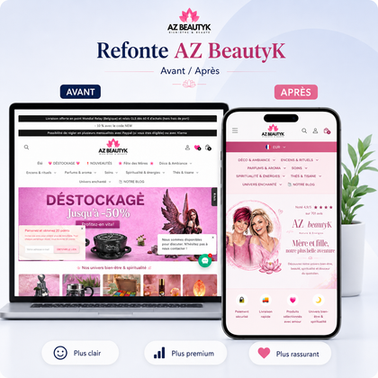
A redesign is relevant when the structure, content and visual direction can no longer support the current offering. Otherwise, targeted improvements may be enough.
Your brand deserves a homepage that resembles it and guides
Transform your identity into a clear, consistent and compelling experience
Have your message, your structure, your content and your mobile journey analyzed.
