

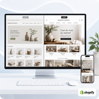
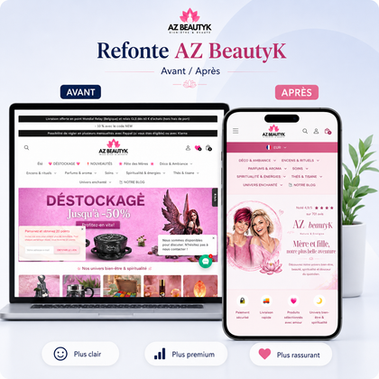



A coherent visual identity is built with few rules, but precise rules
To create a coherent visual identity on Shopify, first define your positioning, then a stable system: limited palette, two typographic families maximum, constant photographic style, reusable components and rules of use adapted to mobile. Consistency does not come from the number of effects, but from the controlled repetition of the same choices.
Guide written by SiteQuiVend, specialist in the creation and redesign of websites and Shopify stores. Information updated August 2026.

What is a consistent visual identity on Shopify?
It is a set of graphic choices that allows you to recognize the same brand on the home page, collections, product sheets, shopping cart, emails and social networks.
A visitor should not feel like they are changing universes between two pages. Accent colors, button shapes, photo processing, icons and title tone should follow a common logic. This continuity reinforces readability and perceived seriousness; however, it does not guarantee sales or conversion rates.
Concrete example: a natural skincare brand can choose a reassuring midnight blue, a soft ivory, an orange reserved for stocks, bright photos on a mineral background and short titles. If a product sheet suddenly adds purple, strong shadows and a handwritten font absent elsewhere, the brand seems less controlled.
1. Start with positioning, not colors
Before opening the theme editor, formulate in one sentence what the brand offers, to whom and with what difference. Add three personality adjectives - for example "precise, approachable, energetic". Each visual decision must then serve these words.
Clarify your promise
A premium, educational or fun store does not prioritize information in the same way. The promise determines the level of sobriety, the rhythm and the place of proof.
Observe your real audience
The design should help the customer understand and choose. Consider his vocabulary, his obstacles, his mobile habits and the time he has.
2. Build a simple, documented visual system
A one-page mini-charter is often enough to get you started. It must indicate the colors with their codes, the fonts, the button styles, the radius of the cards, the processing of the images and some examples "to do / to avoid".
| Element | Decision recommended | Checkpoint |
|---|---|---|
| Colors | 1 main color, 1 accent, 2 to 3 neutrals | Sufficient contrast and emphasis reserved for priorities |
| Typographies | 1 title font and 1 text font maximum | Readability of small texts on mobile |
| Photographs | Same light, framing and color temperature | Homogeneous product sheets in a collection |
| Components | 2 styles of buttons, cards and stable pictograms | Same action = same appearance |
| Spaces | A small scale repeated: 8, 16, 24, 40 px | Regular rhythm without large arbitrary voids |
To learn more about the diagnosis, also consult the guide on signs that make a Shopify store unprofessional.
3. Translate these rules into the Shopify theme
In the theme settings, first enter the overall colors and typographies. Avoid correcting each section independently: exceptions accumulate and become difficult to maintain. Then create a small library of recurring sections.
Header and navigation
Readable logo, short menu, accessible search and icons from the same family. On mobile, check that labels do not overlap.
Pages and collections
Use the same content widths, title levels, backgrounds and spacing. A product grid must maintain images at a constant ratio.
Product sheets
Price, variants, profits, delivery and buy button follow a steady order. Secondary blocks should not compete with the main action.
Mobile
Reduce decor before content: sharp contrasts, easy-to-touch buttons, short lines, optimized images and no fixed width causing overflow.
4. The most common inconsistencies to correct
- Add a new color for each promotion or collection.
- Mixing multiple styles of photos, icons, and illustrations without a common rule.
- Use different buttons for the same action, or give the same style to actions with different priorities.
- Multiply title sizes and spacing instead of using a stable scale.
- Copy a visual trend that contradicts positioning or interferes with reading.
- Control only the computer while the majority of the route can take place on a telephone.
Proceed page by page, but always validate the result as a whole. A local correction can be elegant and still weaken overall consistency.
Which service to choose?
The right level of support depends on the current state of the store and the clarity of your visual direction.
Checklist before publishing your visual identity
- The promise and three brand adjectives are written.
- Color codes and their uses are documented.
- A maximum of two fonts are configured globally.
- The main and secondary buttons are separate.
- The photos follow constant framing and light.
- Collections use identical image ratios.
- The card spacings and radii are repeatable.
- Home, collection, product and basket are checked together.
- The contrast remains readable on dark and colored backgrounds.
- The store is verified at 375 px without horizontal overflow.
Shopify Visual Identity FAQ
Do you need a logo before creating your Shopify store?
A logo helps, but it's not enough. Above all, you need positioning, palette, typography, image style and rules for site components.
How many colors to use on Shopify?
One main color, one accent color, and two or three neutrals cover most needs. Emphasis must remain rare in reporting important actions.
Can we use multiple fonts?
Yes, but two families are generally enough: one for titles and one for texts. Too many variations make the hierarchy less clear and can make the load heavier.
How to keep product sheets consistent?
Create a common template: same image ratio, same information order, same styles of variants, accordions and buttons. Only product-specific content needs to change.
Does a visual identity automatically improve sales?
No. It can improve understanding and perceived trust, but sales also depend on supply, pricing, traffic, evidence, delivery and shopping experience.
Should we change the theme to harmonize the store?
Not systematically. If the theme remains fast, maintained and flexible enough, better-designed settings and sections may be enough. Change is justified when structural limits block the project.
How to check consistency on mobile?
Test at least the welcome, menu, search, collection, product sheet, variants, basket and forms 375 px. Control contrast, touch zone size and overflows.
When to call a professional?
When you lack direction, the corrections contradict each other or the theme no longer allows you to apply your rules properly. A mini-audit first helps identify priorities.
