
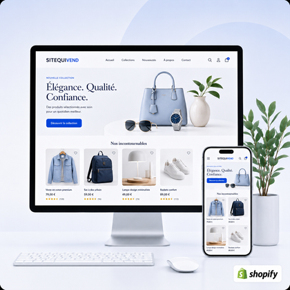
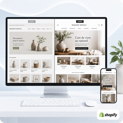




Collection pages are important because they transform a catalog into a choice route. They group the products according to an understandable intention, facilitate comparison and lead the visitor to the most relevant sheets.

Guide written by SiteQuiVend, specialist in the creation and redesign of websites and Shopify stores. Information updated in August 2026.
What is a collection page for in a Shopify store?
Shopify allows you to display a collection as a page with a product gallery. The visitor then opens the file that interests him: this step structures the discovery before the decision.
Express a clear intention
"Hiking shoes", "Gifts for less than €50" or "Office furniture" meet more specific needs than "All products". The visitor immediately understands what he will find.
Reduce the overload of choices
Browsing 300 mixed references takes too much effort. Consistent selection limits the number of visible options, while leaving enough choice to compare.
Organize merchandising
Sorting highlights something new, an available product, a seasonal selection or a priority range. Shopify offers manual and automatic sorting.
Create a sustainable destination
A collection receives links from the menu, articles, home page or campaign. Its URL and content can also respond to a targeted search without replacing the product sheet.
To learn more about architecture, see how to organize collections in a Shopify store and how many collections to create according to the catalog.
How do collections influence the sales journey?
The collection page does not always close the sale itself. Its main mission is to advance a general intention towards a credible product.
What elements make a collection useful for selling?
An immediately understandable title
He must name the family or need without internal jargon. The visitor must know in a few seconds if he is in the right place.
A short and specific introduction
A few lines may specify usage, important differences or selection logic. A long presentation should not unnecessarily push back products.
A readable product grid
Homogeneous images, explicit names, price and availability visible depending on the theme make scanning easier, especially on the phone.
A coherent sorting
The first screen must present representative products. Avoid leaving references at the top that are unavailable or poorly suited to the promise of the collection.
Really useful filters
Size, material, color, usage, price or availability help reduce a large selection. Their relevance depends on their own product data and a compatible theme.
Links to the following steps
Link related categories, choice guides and complementary products when these links answer a real question from the visitor.
Shopify documents it changed title, description, image and sorting, as well as the search & Discovery filters.
Collection, search or filter: which function for which need?
| Tool | Role | Example | Limit |
|---|---|---|---|
| Collection | Organized and shareable destination | Travel bags | Becomes confused if the intention is too broad |
| Filter | Refine an existing collection | Color, volume or price | Depends on consistent product data |
| Research | Find a product or term that is already known | Specific model name | Less guiding for a visitor exploring |
| Product sheet | Explain and enable the final decision | Dimensions, variants, delivery | Does not give sufficient view of the overall choice |
The collection carries the main intention; filters refine; the search responds to specific requests; the product sheet supports the decision.
Concrete example: moving from a raw catalog to a sales journey
Let's imagine a fictitious store of 120 travel accessories. An "All Products" page mixes cabin bags, kits, adapters, labels and cushions. The visitor must interpret the entire catalog alone.
A more useful structure might offer "Cabin Bags", "Suitcase Organizers", "Long Trip Accessories" and "Traveler Gift Ideas". In each collection, the filters then refine the volume, color, price or material. The visitor first chooses an intention, then a criterion.
What collection errors can slow down sales?
Overlapping categories
Two collections with similar names and almost identical products force the customer to guess the difference.
Empty or too poor pages
An attractive promise followed by two products or numerous shortages can reduce the credibility of the catalog.
A sorting left to chance
The first visible products influence the perception of the range. Their order must be controlled and maintained.
Too much text before products
SEO content should help, not hide the selection. On mobile, a concise introduction avoids a long descent before the grid.
Unusable filters
Duplicate values, inconsistent sizes, or missing attributes produce a frustrating experience.
Collections not found
A page without a link from the menu, another collection or relevant content does not really participate in the journey.
To avoid duplicates, see also how to avoid empty or overly similar collections and how to name your collections for SEO.
How to measure whether a collection page fulfills its role?
Define the mission of the page, then compare the available indicators over time:
- visits and their origin;
- clicks to product sheets;
- internal searches or filters used;
- quick exits;
- products often seen but rarely chosen;
- mobile behaviors.
Avoid automatically attributing any variation in sales to the collection: price, stock, traffic, seasonality and quality of product sheets also influence the result. Test one identifiable change at a time.
Which SiteQuiVend service should you choose for your collections?
Public formulas are suitable for a homogeneous scope. The schedule is confirmed after verification of the catalog and receipt of the contents.
To create or resume the main categories.
To structure an intermediate catalog.
To harmonize a larger volume.
For common processing on a compatible catalog.
Sales-oriented collection page checklist
The 12 essential controls
- The intention of the collection is distinct.
- The title is clear without internal jargon.
- The introduction remains short and useful.
- The products all match the promise.
- The first screen presents a credible selection.
- Breakups do not dominate sorting.
- Product images and titles are easy to scan.
- Filters are based on homogeneous data.
- The menu makes the collection easy to find.
- Links connect nearby categories.
- The mobile rendering is tested at small width.
- A control frequency is provided.
FAQs about collections pages and sales
Does a collection page automatically increase sales?
No. It can reduce friction and improve discovery, but sales also depend on traffic, prices, inventory, products, records, trust and payment.
What is the difference between a collection and a Shopify category?
In common usage, a Shopify collection often serves the role of category: it groups products together and can appear as a page with a gallery.
Should you display a description at the top of the collection?
Yes when it helps to understand the selection, but it must remain concise. Too long a block can push products away, especially on mobile.
What order of products to choose from a collection?
The order depends on the objective: representative products, available, new products or manual selection. Above all, check the first screen and avoid highlighting breaks.
Do filters replace collections?
No. The collection has a main intention and a lasting URL; filters are used to refine this selection according to attributes such as size, material or price.
Can one collection contain the same products as another?
Yes if the intentions are really different. However, avoid multiplying pages with almost identical titles, content and selection.
How many products should be displayed in a collection?
There is no universal number. The selection must be rich enough to keep its promise without becoming difficult to navigate; filters and pagination depend on the catalog and theme.
Can SiteQuiVend optimize existing collections?
Yes. Formulas cover creation or optimization in Shopify depending on the validated scope. Complete writing, new images, specific filters, translation or an overall navigation redesign are evaluated separately.
