
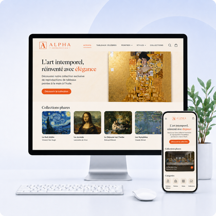

What items to place on a store's homepage?
An effective homepage allows you to understand the store, identify the main categories and quickly choose the next step. It must guide before trying to show everything.
The home page should give directions, not present the entire catalog
A new visitor must understand the offer and find a gateway. A customer who already knows the store must quickly access the new products, categories or products sought.
A complete structure in 10 blocks
A really useful ad bar
It must present information that influences the purchase, not a generic sentence.
Relevant information
- Free delivery threshold
- Exceptional deadline
- Extended returns
- Actual commercial operation
To avoid
- Several messages scrolling too quickly
- Permanent false emergency
- Text too small on mobile
- Information contradicted in the basket
A simple and predictable header
The header accompanies the visitor on all pages. It must make the main actions accessible without gaining too much height.
- Logo leading to reception
- Menu organized by major categories
- Easily identifiable search
- Customer account so really useful
- Basket with visible quantity
- Contact or quote depending on activity
- Clear mobile version
- Fixed header only if it remains compact
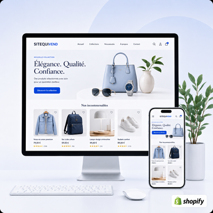
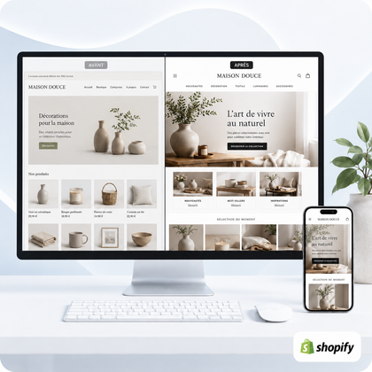
A hero who immediately explains the offer
The first screen must bring together a precise title, a short explanation, a coherent image and a main action.
| Element | Question to which he answers |
|---|---|
| Main title | What does this store offer? |
| Subtitle | To whom and with what benefit? |
| Picture | What do the products look like or the result? |
| Button | What's next? |
Short and precise proofs of confidence
Place three or four items right after the hero or near the first buy shares.
Delivery
Unambiguously formulated area, threshold or deadline.
Returns
Summary deadline and access to the full policy.
Payment
Available means and secure treatment.
Support
Contact and realistic response time.
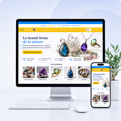
The main collections as entrance doors
Collection cards help the visitor choose a universe without going through the entire menu.
- Representative image
- Name understood without explanation
- Limited number of cards
- Order by importance
- Consistent visual styles
- Links to real destinations
- Text readable on image
- Verified mobile cropping
An easy-to-understand selection of products
Choose a single logic and name it clearly.
Bestsellers
Useful for directing a new visitor to popular choices.
New
Relevant for repeat customers and launches.
Seasonal selection
Adapted to an identifiable need or period.
Recommended products
To be used if the selection is based on a clear criterion.
A section that explains the difference in brand
After showing the offer, explain why it is worth choosing.
- Selection method
- Manufacturing or know-how
- Materials or composition
- Special service
- Personalization
- Demonstrable expertise
- Specific commitments
- Link to About page
Credible social opinions and evidence
Show detailed experiences rather than just a single isolated note.
Product reviews
Sufficiently precise note, date, product and text.
Testimonials
Context, initial need and observed result.
Customer content
Photos or videos used with permission.
Achievements
Project available for consultation, before/after or case study.
A human presentation of the store
A short section can show the person, team or workshop behind the products. It particularly strengthens trust in a brand that is still little known.
Content that helps you choose
Articles and guides should extend the discovery and lead naturally to the products.
Choice guide
Compare sizes, materials, uses or functionalities.
Maintenance tips
Reassure on service life and use.
Inspiration
Show ideas for style, layout or routine.
Frequently asked questions
Respond to objections before purchase.
A short FAQ on the main objections
The home page doesn't need to repeat all policies. Answer the questions that most often prevent you from continuing.
- Delivery times
- Returns
- Choice of size
- Personalization
- Composition or origin
- Guarantee
Subscribing to the newsletter with a real reason
"Subscribe to our newsletter" describes the action, but not the benefit. Explain what the person will receive and how often.
| Weak formulation | Useful wording |
|---|---|
| Don't miss any news | Receive our new guides and launches once or twice a month |
| Enjoy -10% | Receive a welcome code valid on your first order, conditions specified |
A footer that completes the navigation
The footer accommodates important information which should not overload the header.
Navigation
- Main categories
- About
- Contact
- Advice or blog
Information
- Delivery
- Returns
- FAQs
- Order tracking
Legal
- Imprint
- Confidentiality
- Conditions
- Refund
Relationship
- Newsletter
- Social networks
- WhatsApp if used
- Contact details
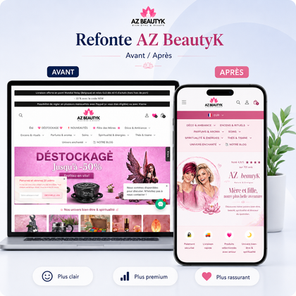
Which must remain a priority on the small screen
- Short and readable hero
- Main button visible
- Simple menu to close
- Easy to scroll collections
- Fairly large product cards
- Images cropped correctly
- Compact secondary sections
- Non-excessive texts
- Absence of superimposed windows
- Fast enough loading
The home page must evolve with the type of store
| Situation | Elements to favor |
|---|---|
| New brand | Differentiation, history, evidence and reassurance |
| Large catalog | Collections, research, categories and best sellers |
| A main product | Benefits, demonstration, evidence and frequently asked questions |
| Technical products | Uses, choice guides and compatibility |
| Visual products | Atmosphere, collections and customer content |
How do I know if the home page is working?
Don't just measure sales directly attributed to the homepage. Analyze its ability to send visitors to the right destinations.
- Clicks the main button
- Most open collections
- Products viewed next
- Use of search
- Navigation depth
- Additions to cart after passage
- Difference mobile and computer
- Sections rarely consulted
Which weakens a home page
A purely creative title
The store remains difficult to understand without scrolling.
Too many promotions
Multiple simultaneous offers prevent priority from being identified.
Repetitive carousels
The products look similar and the page becomes long without providing direction.
Generic texts
"Quality and passion" does not prove the difference in the offer.
A page designed solely for computers
The hero, images and menus become cumbersome on mobile.
Too heavy a page
Images, videos and apps delay access to essential content.
Controls before publication
- Offer included in three seconds
- Identifiable main action
- Accessible priority collections
- Consistent strategic products
- Precise differentiation
- Credible evidence
- Visible reinsurance
- Mobile navigation tested
- Optimized images
- Functional links
- Full footer
- Expected click measurement
Shop Homepage FAQ
How many sections should be planned?
There is no mandatory number. Keep only the sections that orient, reassure or differentiate. A short but clear page is better than a long succession of similar blocks.
Should prices be displayed on the home page?
Yes on product cards when it makes the decision easier. Hiding them often creates an additional click without benefit.
Is a video useful in the hero?
Only if it quickly explains the product or result without slowing down the page. Plan a replacement image and avoid automatic sound.
How often should the reception be changed?
Update campaigns, news and seasonal content, but maintain a stable structure so as not to disorient regular visitors.
A clear showcase to guide each visitor to the right next step
SiteQuiVend can design or redo your Shopify home page with a structure adapted to your offer, your catalog and your commercial objectives.
