
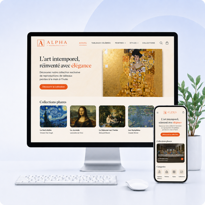

Design, conversion and strategy
A beautiful site catches the eye. A good guide site until purchase.
A neat visual identity is important, but it does not replace a clear offer, smooth navigation, or proof of trust. To sell, each screen must reduce hesitation and facilitate the next action.
Real question not 'Is it pretty?'
Ask instead: does a new visitor understand in seconds what you are selling, for whom, why you choose and how to buy? If the answer is no, design becomes a pleasant decoration around an incomplete commercial journey.
pillars work together: value proposition, offer, trust, experience and acquisition.
Why aesthetics alone don't convert
The message remains unclear
A beautiful image doesn't automatically say what you're selling. Without a precise title, concrete benefit and identifiable target, the visitor must guess.
Supply lacks value
The customer does not buy a layout. It buys a result, a solution, a time saver, pleasure or a reduction in risk.
The route creates obstacles
Too complex menus, discreet buttons, weak filters, scattered information or confusing shopping carts can block the purchase despite a premium rendering.
Trust is not demonstrated
Notices, deadlines, returns, payment, contact details and guarantees must be visible at the right time. A professional appearance is not enough to allay all fears.
Traffic is poorly targeted
Even a great store sells little if it attracts visitors with no intention of purchasing or if its offer does not meet their expectations.
Nothing is measured
Without data, decisions are based on preferences. The cart addition rate, payment changeover and conversion reveal the real blockages.
The journey that turns a visit into a sale
Attract the right person
SEO, advertising, social media or recommendations should promise exactly what the landing page delivers.
Make the offer understood immediately
Introduce the product, its target, its main benefit and your difference before asking the visitor to explore.
Make people want and respond to objections
Useful photos, benefit-oriented description, characteristics, uses, availability, delivery and returns must form a complete response.
Reassure before engagement
Show tailored evidence: verified reviews, achievements, warranties, customer service, security and clear conditions.
Make action obvious
A visible call to action, editable shopping cart, and simple payment reduce mental load and dropouts.
What each page should actually accomplish
| Page | Commercial mission | Signal to watch |
|---|---|---|
| Home | Quickly direct towards priority offers and establish the brand promise. | Clicks to collections or services |
| Collection | Help compare, filter and find effortlessly. | Clicks to product sheets |
| Product sheet | Create desire, inform and remove objections. | Cart Add Rate |
| Basket | Confirm choice, costs and next step. | Switching to payment |
| Payment | Finalize without surprises or friction. | Conversion rate |
| About | Give a face, a story and reasons to trust. | Journey to offer or contact |
Visual details that can cause sales to lose
Too artistic hierarchy
- Impressive titles but not very precise
- Text too clear or too small
- Buttons melted into the composition
- Animations that slow down reading
Design disconnected from use
- Beautiful but uninformative images
- Mobile treated as a reduced version of desktop
- Excessive spaces that keep information away
- Originality which replaces useful conventions
Express diagnosis: where is the blockage located?
Few visitors
Work on acquisition, SEO and targeting quality before redoing the entire interface.
Visits but few view sheets
Clarify the welcome, menu, categories and product entries.
Sheets viewed but few additions
Review the offer, visuals, perceived price, description and evidence.
Additions but few payments
Control fees, delivery, cart, payment methods and errors.
Payments started but not completed
Simplify fields, correct technical blocks and strengthen final reassurance.
Sales but low loyalty
Improve after-sales experience, real offer quality and customer relationship.
Improvement plan in 7 priorities
1. Clarify the promise
A sentence understandable by someone who doesn't know your brand.
2. Simplify the menu
Familiar labels, few levels and direct access to major categories.
3. Strengthen the files
Useful photos, benefits, details, availability, delivery, returns and reviews.
4. Show evidence
Place evidence near decisions, not just in the footer.
5. Optimize mobile
Control readability, buttons, speed, filters, keypad and payment on a real phone.
6. Measure the tunnel
Follow the visits → product → basket → payment → order.
7. Test a hypothesis
Change an important problem, measure, then decide what happens next.
Frequently asked questions
Should you choose between beautiful design and conversion?
No. Better design makes value clearer and action easier. Aesthetics must support business strategy.
Does a premium Shopify theme guarantee more sales?
No. It provides a functional basis, but content, supply, structure, evidence and traffic quality remain decisive.
What improvement should be made first?
Start at the tunnel stage where the loss is greatest. Without data, first check the clarity of the offer and the mobile journey.
Is a complete overhaul still necessary?
No. Some stores are progressing thanks to targeted corrections. A redesign becomes relevant when the structure, theme or technical debt limits several stages of the journey.
Your store can be beautiful and efficient
Transform your design into a journey that makes you want to buy
Have the clarity of your offer, navigation, product sheets, trust and friction points analyzed.
